I thought that it might be helpful to post some information to help beginners and non-designers plan out and design graphics that communicate what you want or need to say. There are a lot of things that go into making a good user-centered design and here I can only mention a few aspects to help you think through the basic underpinnings of your graphical presentation of information.
Communication

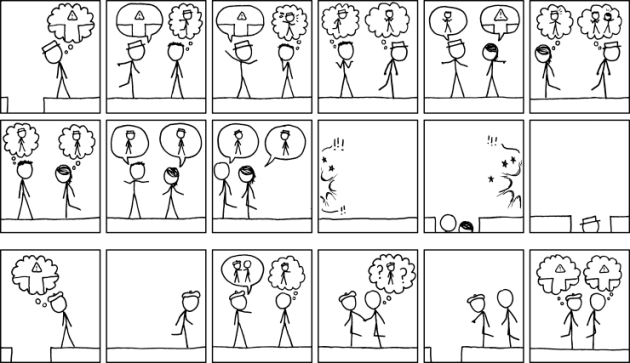
Munroe, Randall. “Xkcd: Communication.” Web log post. Xkcd: Communication. http://imgs.xkcd.com/comics/communication.png ©Creative Commons, Web. 08 April 2014.
AS A FUNDAMENTAL POINT, it is important to understand what you are trying to say— to understand the “What” and to say it—and not something else. What you want to say should be clear and unambiguous, so that the audience will be able to visually grasp the structure in which you are organizing information; the organizational pattern for the information should match the real-world structure of whatever you are trying to represent.
For example, if you wanted to show the structure of a course you teach, you might make an icon (here an orange circle labeled “Teacher”), encircled by smaller icons (blue triangles, each labeled by class participants’ names). A “Key” is needed to make clear to the user whatever meanings are assigned to code the graphic’s colors and shapes. Top it with a “Title” and “Caption” it below. Don’t forget to add any citation information that denotes any source permissions and copyright details, including the website URL and date of website access.
The graphic’s structure maps the real-world organization you want to illustrate.
The audience sees the organization of such a chart, graphic, or picture and understands and absorbs the information more easily, because the graphic representation of the information visualizes the real-world order of—in this instance—a particular classroom structure, helping the viewers of the graphic to store new information in their memory in a way that makes sense and aids informational recall. Such a graphic would match the real-world organization and hierarchy to the visual design chosen for the graphic to more easily place it in the memory as a match for the thing remembered: The graphic looks like the thing it represents. The viewer’s memory will store such a structure along with the details, and so, the information, as a whole, can be recalled in much more of its entirety when needed by the user.
A well-designed graphic will order information with clarity and precision, so that the viewer grasps both an overview of a body of information, which enlightens the viewer to a structural whole—or in other words, the big picture—and also focuses the viewer’s attention on “close-ups” of each discrete bit of information, which comprise the individual parts of that whole. A good graphic might indicate true hierarchies and patterns of order between the various elements of the information, for example, the nested sets and subsets within a dataset (e.g., administrators and the employees of their departments), the time sequence between different actions (e.g., “First you beat two eggs, then add sugar…”), or several completely conflicting elements (e.g., “Not this…, but this…”).
Additionally, before designing a graphic, you want to ask yourself several questions about the nature of the information that you want to show and about the way you want to show it. Information can be arranged in various ways and here are just a few, which I found on a website from the University of Washington, where more detail about organizing information into patterns can be found (http://faculty.washington.edu/ezent/impo.htm):
• Chronological Patterns
• Sequential Patterns
• Spatial Patterns
• Compare – Contrast Patterns
• Advantages – Disadvantages Patterns
• Cause – Effect Patterns
• Problem – Solution Patterns
• Topical Patterns
Ask yourself the question, “Which one of these patterns would best showcase the elements that I want obviated by my graphic design?” Sometimes the information you want to explicate can be shown using several methods (infographics, tables, graphs, figures, etc.) but not all of those modes will match your intended purpose in creating the graphic. You should understand which basic approach to use for clearly communicating your intended meaning to your audience, the user of the design; you should be clear about your intentions before you start designing.
— Susan LaVelle
