10 Commandments of Usability

The 10 Commandments of Good Website Usability, Jacob Nielsen’s “10 Usability Heuristics for User Interface Design,” are not actually commandments at all, but rather heuristics, or a kind of exploratory underlayment for creating guidelines for usable design.

Commandments or not, ignoring these principles should only be done purposefully, not out of ignorance. Everyone who designs information packages that might find their way onto the web (What information packages won’t find their way onto the web?) should know these usability principles and apply them as needed in their designs. You need to have good reasons not to follow established design principles for usability—and you must be objective, not subjective, in your approach. Don’t just say, “I don’t need that. I know what I want.” Too often those who create websites or write content for them don’t know good principles for user-centered design. At some point in the future, I hope to put together a blog series to help us flesh out how these specific principles. In the meantime, the 10 Commandments of Usability will help us form a solid foundation for creating good user-centered communication.

The audience or user is the center of what goes on in any communication, because

to communicate is to transmit information, thought, or feeling so that it is satisfactorily received or understood.”

When you communicate, you impart information to someone; you share that discreet unit of information—from you to other—so that you can have commonality with whoever receives it.

Once received, the ideas about the communicated information may change from the intended purpose of the sender, for example, the person receiving the communication may accept the information as factual or reject it as false; may be enraged or impassioned by it; may be swayed to act or discouraged from acting; may seek for more information or be satisfied with what they already know. Communication is a much more difficult and troublesome event than simply posting, saying, or writing something. Communication is not information upload.

colander-trick

Communication is not mechanical upload.

The mechanical approach (input > output) to communication has been all too common, however, and there are no signs that this is really changing, despite the availability of online information.  True, businesses and other entities, including individuals, increasingly are concerned with users and audience; we should be glad about that. Information about how to do a better job of designing for users is so much more accessible these days. For example, Nielsen’s Heuristics are easily found in multiple places online and, in fact, you can sign up to receive regular academically researched articles and updates from the Nielsen–Norman Group to improve your familiarity with usability principles. I would encourage you to do so.

The chance to become a better communicator on every level, including writing and designing for the web, is made much more accessible because of the Internet, everyone knows that. However, the broadening of the accessibility has also made the availability of web creating tools more pervasive and so has spread bad design and insensitivity to audience farther and wider than ever before.

How can these 10 “not-commanded” Commandments of Usability be useful to us generally in our day-to-day communication acts?

Can those people that find themselves creating content—whether on the web or anywhere else—find any principles that bring value to us when we create our designs? I hope to write a series of blogs in this year to discuss how these 10 principles apply to our communication events and designed artifacts.

References:

https://www.nngroup.com/articles/ten-usability-heuristics/

“Communicate.” Merriam-Webster.com. Merriam-Webster, n.d. Web. 28 May 2016.

“Abbott & Costello Who’s On First.” YouTube. Koch Entertainment, n.d. Web. 28 May 2016. <https://youtu.be/kTcRRaXV-fg&gt;.

Mind reading machine. Digital image. N.p., n.d. Web.

Abbot and Costello’s “Who’s on First?” (08:03)

Framing

Scenario 1:

See yourself entering a gallery, walking down a long empty hallway, surrounded by white walls, white floors, white ceilings, rooms illuminated by bright but diffused lighting, whiteness radiating throughout. You see ahead of you a wall that features one painting, hung two-thirds of the way up the wall, in a plain white frame, highlighted by a backlight, which seems to produce a halo around the whole representation. On the painting is a small, barefooted child—a little Asian girl, loosely holding a toy animal by its ear; from the child’s eyes falls one tear.

Scenario 2:

Next, see yourself entering another gallery, the walls are steel gray, the floor, cement. The walls above hold industrial lighting suspended from exposed steel crossbeams. You begin to encounter various bits of rubble—some broken concrete, bits of trash, ash, rebar—and pits dug unevenly in the floor; everything seems broken, disrupted. You enter a room with large black and white images of destroyed buildings one-after-another, on easels, hung randomly at angles, hung on the walls, hung on the ceilings. You smell an ashy heat. You hear the blare of sirens. Then, after seeing a large map of Nagasaki and Hiroshima in Japanese, you see, displayed on an easel, the same painting of the Asian child.


What did the painting mean? What did it signify? Did its meaning change from Scenario 1 to Scenario 2? But it was the same picture in the same frame! How could its meaning change? In each of these scenarios, the difference between the interpretations of the painting’s meaning or significance is in its “Framing”—the framing, not the frame.


From this example, you can see how the sequence and experience of events and the proximity to accompanying surroundings color the interpretation of meaning, because the set-up for the encounter changed and so has the resulting impact on its significance.

Framing can have a powerful, although not necessarily recognized, influence on the way that we interpret meaning as we navigate our daily lives. This rhetorical principle is around us every day and yet, the effect that framing has upon our interpretation of meaning is rarely noticed.

Framing, in a rhetorical sense, is the physical (or other) properties that surround an entity or artifact, which change or influence the meaning or signification of the entities in locational or other correspondence with each other. In other words, the things next to each other affect what the things seem to mean to the audience.


“Framing is” according to Jim A. Kuypers in Rhetorical Criticism: Perspectives in Action (182) “the process whereby communicators act—consciously or not—to construct a particular point of view that encourages the facts of a given situation to be viewed in a particular manner, with some facts made more or less noticeable (even ignored) than others. When highlighting some aspect of reality over other aspects, frames act to define problems, diagnose causes, make moral judgements, and suggest remedies. They are located in the communicator, the text, the receiver, and the culture at large.” The frame sets up influences through which meaning is affected through the transference of “interpretive cues” from one element to another in its proximity.


Transference of feeling through circumstance or environment happens all the time, both intentionally and unintentionally. Who has not walked outside the door of work and let the type of day—sunny, rainy, cold, hot—influence the way that you feel on your drive home? Emotions about what we see or hear, frequently influence us in subtle or obvious ways, seemingly transferred to us through the circumstances surrounding us. But what else might transfer?


Along with a transference of feeling, a corresponding transference of meaning can also occur; such transference might also be subtle or obvious. In the previous sunny day example, you generally do not also start thinking that the actual meaning or significance of the day has changed to reflect the positive feelings of happiness that the sunshine brings. You would hardly say and believe, “Oh, it is sunny! This must mean that today is my day to find a pot of gold!” and quit your job. Such a transference of meaning or significance accompanied with sincere acceptance or belief without any logical or reasonable bases for it would be called “wishful thinking” at best, or even, mental instability or illness, if the changes of significance reflected too deeply within the person’s conscious or subconscious mental makeup. We feel and react significantly, based on our emotional influences throughout the day, but really, we don’t let it transfer into what we believe and think about the universe we live in.


Actually, however, in addition to being influenced emotionally by the things we see and hear, we very often do let the subtle transference of meaning through framing influence the assignment of significance given to artifacts and happenings around us. The arrangement of entities or proximity of the frame to other artifacts and happenstances often affects the judgements we make about the things we see and hear. We need only to look at electronic media, printed materials, or blogs posted online to see how framing influences our assignment of  meaning to artifacts.


Take, for example, a newspaper article about any topic. Depending on the articles before it or after it, or the headlines, pictures, or captions accompanying it, you might believe or understand the article itself framed in a way that does not represent the context of the events, details, narratives, or opinions expressed in the article. The framing might actually lead you to understand a meaning for the article completely opposite of the one from which the author intended in writing it.


Imagine an article written to honor the career of a particular politician or public figure, but with nearby articles that discuss controversial events that took place under that person’s leadership, framing the original article in a way that undermines the ideas within. Without stating it overtly, you can introduce ideas through framing that are subliminal or subconscious, yet powerful rhetorically. The same can easily be true for articles or “content chunks” found on the Internet or items watched on the television news. In these cases, a visual proximity between entities influences the significance of what the reader finds in the article.


Additionally, when there is a particular happening, such as an election, speech, national celebration, holiday, or other such event coming up or just passed, a kind of emotional framing influences us. Advertisers or other “persuaders” use anything in the national or cultural consciousness as a frame for crafting subtle influences to their messages. For example, advertisers use public attention to a coming national event to influence our reaction to some other event, artifact, or idea.


A perfect example of this might happen if you frame the promotion of a work-out gym during the media buzz of the Olympic Games: people are already thinking about fitness and athleticism, so they will already have an internal, background noise about the value of getting in shape to bring into the idea of joining the gym. Another example might be selling boats or luxury vehicles during a bull market or when the end-of-the-month job growth stats are positive. The general consciousness of what is going on—the social or political milieu—influences people’s choices about and beliefs in the significance of any artifact of communication, because what people believe and how they act are easily influenced by what “frames” their experienced circumstances and what they see and hear and read. This is another way to perceive a framing influence.


The possibilities for seeing this kind of influence are endless, once you start looking for them. Ideas, actions, and beliefs can be influenced by placing communicative artifacts in proximity to surrounding referents or within contexts crafted from either our day-to-day lives or other sources, such as those carrying historical or political connotations. This process is a common, fairly simple, but easily overlooked, concept. But, just pick up a newspaper or watch a nightly news broadcast. Look in the grocery store magazine rack or the aisles at the store. Framing works there too. Influence carries over from one proximity to another, and we often let the meaning of one thing impact the next.


In the hand of a marketer, rhetorician, or any person wishing to use persuasion, the tool of framing is powerful.


Going back to our painting again, one can imagine the process of choosing the frame for the painting. One might look through the colors on the canvas and choose one or more that “bring out” something in the image, to color coordinate things so that it will match the surroundings in an eye-pleasing way. People often do something like this when they are trying to pick a good tie: “Wow! Sir, Try this tie! The yellow in the shirt really makes this tie pop!” So, you pick a good tie based on coordinating the color scheme. Similarly,  using a story to “pull” something out and “feature” that element through framing might be useful, but also might be manipulative and even abusive.


Can you see how that might work? For example, I may have a story about veterans’ rates of depression or suicide. I could present the story as “straight” as I could, in other words, as close to the narrative of the author’s intention or context. Or, if I want to let the story illustrate something particular, I could pull certain quotes out of the story or find an illustrating picture and caption it in such a way that would make the story serve my purpose, whatever that may be. I have then framed that story to accomplish a rhetorical (persuasive) purpose, rather than an informative one, no matter what the original intention was in the author’s mind.


To a rhetorician, it would be impossible to ignore that every act is a rhetorical one. And, it is true: every word spoken persuades someone of something—why say anything ever if you don’t want to persuade someone of something? Additionally, authorial intention is neither a static concept nor is such understanding as easily attained as might be supposed. However, most people let this entire level of communication and comprehension slip past them without notice. When they do, however, they actually are giving up a portion of their right to weigh things rationally, rather than to absorb the ideas of whomever is trying to slip something past in the stream of unseen and unexamined influence.

References:

Kuypers, Jim A. Rhetorical Criticism: Perspectives in Action. Lanham, MD: Lexington, 2009. Google Books. Web.

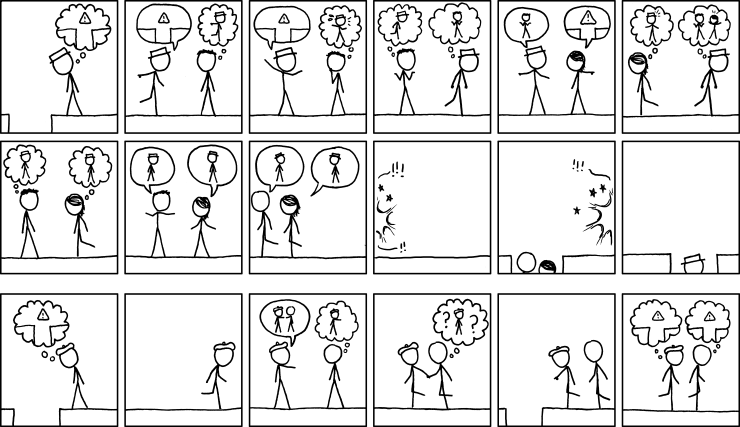
Munroe, Randall. “Xkcd: Board Game.” Xkcd: Board Game. N.p., n.d. Web. 20 Feb. 2016. http://xkcd.com/1566/.


board_game

Audience


How often have you read or seen something and then wondered, “For whom was this written? To whom were they speaking?” All too frequently, speakers and writers speak and write to themselves or to people just like themselves, rather than to the actual audience that will hear or read their words. Case in point: Have you ever listened to a public discourse or sat in an introductory-level class, where the speaker assumes that the audience possesses a base knowledge of the topic that is inappropriate for the venue, by using insider’s vocabulary that is incomprehensible to newcomers to the topic? Most of us have experienced this. Such instances are examples of unclear communication because the words were not aimed at the actual listeners or readers, but rather, primarily, aimed at impressing the speakers’ or authors’ peers with their own intelligence. Have you ever seen a sleekly designed website or other product that you can’t actually figure out how to use? Again, such creations were not designed for the user of the product, but rather, to impress other designers. The obvious—but not always recognized—issue is that if an audience can’t understand the discourse or the user can’t use the product, then the process of composing or designing has failed its primary mission: to reach its audience.

An audience receives what it is actually presented with, not what the mind of the creator thinks it has presented; if the audience can’t understand or misunderstands the written or spoken text, then the impression left on them will be outside the intended meaning of the discourse.

Therefore, to communicate, an author or speaker must take the actual audience into consideration right from the start when composing a message. To do so, the author must understand the audience—both the primary and the secondary audience that will potentially receive that message. Such things as sentence complexity, the use of metaphor and figures of speech, first or third person, personal or impersonal tone and voice, word choice, directness and familiarity, formality, and other factors need to be consistent and intentionally used, rather than randomly applied, in order to communicate effectively. Furthermore, all of these elements need to be geared toward the actual audience that will be receiving the discourse, if misunderstanding is to be avoided and intended meaning is to be communicated.

The primary audience is the target audience, the one that writers or speakers intend to reach with their discourse; the communicative needs of that primary audience must be clearly understood by the speaker or writer before they speak or write. Identifying who that audience might be would be the first step to understanding how to reach them and this might be accomplished by things like brainstorming ideas of who you think you want to reach and bouncing those ideas off of others with similar focus to yours. Additionally useful would be some basic demographic research to further identify the general characteristics of those people whom you identify. Learning the actual needs and wants of those you identify would be the second step, something that only research—asking questions, conducting surveys—will actually find out.

Don’t assume that you know what people think, because such assumptions will undoubtedly result in a skewed idea of your audience that will more than likely represent stereotypes, rather than actual people. Targeting stereotypes for your audience is something that will be noticed by the readers and listeners and will more than likely alienate them and backfire on your intended purposes.

Another important consideration—especially in this day of digital text—is that in addition to your primary audience, you have a secondary audience. By trying to imagine how the text or discourse you are composing will be shared to others, you can attempt to take that secondary audience into account. For example, is your blog geared to teachers? If so, then your blog message might be seen by students, parents, or your principal or the school board members that have hiring and firing power over you. Thinking in advance about where your discourse might be shared is only common sense, but how often do people fail to account for it? Although impossible to take every possibility into account, by trying to imagine potential ways that your discourse might be disbursed on media other than the original platform, you can anticipate an additional audience and take that information into consideration in further selecting an appropriate style and tone for what you publish or present.

Planning with audience awareness in mind is all about how to make a connection and how you, as an author or speaker, can be understood clearly and unambiguously by the audience that is on the receiving end of your communication event.

content.php.gifPiraro, Daniel. “Bizarro Comic Strip for February 01, 2016.” Comics Kingdom. N.p., n.d. Web. 1 Feb. 2016. <http://comicskingdom.com/bizarro/2016-02-01&gt;.


Documentation Management

“Documentation management is the bane of many a project manager’s existence. Yet, without a clear and simple documentation management system projects often go astray. Your team members need to be able to find their documentation when they need it. If they can’t; they’ll go and do other things instead–or waste hours of time trying to find it. Neither of these things is good for the health of your User interaction (UX) project. So let’s look at some simple tips for better document management on UX projects:” For more of the article, click here.

Dilbert Naming Conventions

How to Design Your Graphics for Effective Communication, Part 2

Part 1 of this series presented a series of organizational patterns seen as basic content structures, such as the patterns of chronology, sequence, space, comparison and contrast, or cause and effect. The question was asked, “Which one of these patterns would best showcase the elements that I want obviated by my graphic design?” 

In Part 2, we will be discussing a basic approach to creating the underlying framework of an effective graphic.

How can designers ensure that the intended message comes across clearly in the graphics they create?

ONE THING USEFUL for beginning designers and non-design specialists would be to write a short purpose statement of what you are trying to accomplish and communicate by using graphics in your design. If you can’t clearly and unambiguously state with words what you are trying to communicate to the audience, you won’t be able to communicate that purpose clearly through the graphic you design, either. The purpose of your communication should be central to what is communicated to the audience; the “coolness” of a new infographic tool, color-combination template, neat font or latest tech-tool trick or trend, or whatever else distracts us, can work against clarity and effectiveness, making communication of intended meaning a hit-or-miss endeavor.

By zeroing in on your purpose through the written statement, you will be able to pull out some verbs and key concepts to clue you into the pattern of visual organization to best illustrate your information. For example, if you have a purpose statement that says something about illustrating the negative and positive issues involved in the “digital divide” you will see that several of the words—“negative/positive” and “divide”—point to a Compare and Contrast Pattern; in fact, such words almost beg the use of an illustration that divides the design space into two or more parts. If the pattern that is most implied by the words you use is not the type of organization that would best illustrate your point, you might consider selecting new words to better match whatever organizational pattern you envision for your message or else, make it very clear through your illustration why your words work against the grain of preconceived patterns.

The point is that going down “underneath the skin” of any graphic should tell you something about the graphics’ structure, about the basic idea, conceptual model, or organizational mode to drive your point forward or to frame the illustration. In creating a graphic to communicate something, you need to know what specifically you want to say before you start designing. If you structure your design with an organizational framework based on the “skeleton” of purpose, the details will follow from there, helping you know what creative method to use to design the artifact. Your message will get across to your audience with less ambiguity and more clarity, so that the audience will more quickly absorb and more thoroughly retain the information you present. You would be surprised how many people do not do this simple preparatory work before they put together a chart, figure, or graphic element.

A great process starts with a purpose statement, moves on to sketching a prototype, asks for user input at any and all stages, and then, makes decisions about what sort of software is needed for composing the graphic.

— Susan LaVelle

Aaron Kuehn. SKELETON TYPOGRAM

Skeleton Typogram by Aaron Kuehn is licensed under a Creative Commons Attribution-NonCommercial-NoDerivs 3.0 Unported License. http://aaronkuehn.com/art/skeleton-typogram

How to Design Your Graphics for Effective Communication, Part 1

I thought that it might be helpful to post some information to help beginners and non-designers plan out and design graphics that communicate what you want or need to say. There are a lot of things that go into making a good user-centered design and here I can only mention a few aspects to help you think through the basic underpinnings of your graphical presentation of information.

Communication

Cartoon, problems in communication solved by putting the correct idea into another's head.

Munroe, Randall. “Xkcd: Communication.” Web log post.  Xkcd: Communication. http://imgs.xkcd.com/comics/communication.png ©Creative Commons, Web. 08 April 2014.


AS A FUNDAMENTAL POINT, it is important to understand what you are trying to say— to understand the “What” and to say it—and not something else. What you want to say should be clear and unambiguous, so that the audience will be able to visually grasp the structure in which you are organizing information; the organizational pattern for the information should match the real-world structure of whatever you are trying to represent.


For example, if you wanted to show the structure of a course you teach, you might make an icon (here an orange circle labeled “Teacher”), encircled by smaller icons (blue triangles, each labeled by class participants’ names). A “Key” is needed to make clear to the user whatever meanings are assigned to code the graphic’s colors and shapes. Top it with a “Title”  and “Caption” it below. Don’t forget to add any citation information that denotes any source permissions and copyright details, including the website URL and date of website access.

A graphic explaining the point.

KEY:   Orange = Teacher and Blue = Student; Circle = Class administrator and Triangle = Participant


The graphic’s structure maps the real-world organization you want to illustrate.

The audience sees the organization of such a chart, graphic, or picture and understands and absorbs the information more easily, because the graphic representation of the information visualizes the real-world order of—in this instance—a particular classroom structure, helping the viewers of the graphic to store new information in their memory in a way that makes sense and aids informational recall. Such a graphic would match the real-world organization and hierarchy to the visual design chosen for the graphic to more easily place it in the memory as a match for the thing remembered: The graphic looks like the thing it represents. The viewer’s memory will store such a structure along with the details, and so, the information, as a whole, can be recalled in much more of its entirety when needed by the user.


A well-designed graphic will order information with clarity and precision, so that the viewer grasps both an overview of a body of information, which enlightens the viewer to a structural whole—or in other words, the big picture—and also focuses the viewer’s attention on “close-ups” of each discrete bit of information, which comprise the individual parts of that whole. A good graphic might indicate true hierarchies and patterns of order between the various elements of the information, for example, the nested sets and subsets within a dataset (e.g., administrators and the employees of their departments), the time sequence between different actions (e.g., “First you beat two eggs, then add sugar…”), or several completely conflicting elements (e.g., “Not this…, but this…”).


Additionally, before designing a graphic, you want to ask yourself several questions about the nature of the information that you want to show and about the way you want to show it. Information can be arranged in various ways and here are just a few, which I found on a website from the University of Washington, where more detail about organizing information into patterns can be found (http://faculty.washington.edu/ezent/impo.htm):

•          Chronological Patterns

•          Sequential Patterns

•          Spatial Patterns

•          Compare – Contrast Patterns

•          Advantages – Disadvantages Patterns

•          Cause – Effect Patterns

•          Problem – Solution Patterns

•          Topical Patterns

Ask yourself the question, “Which one of these patterns would best showcase the elements that I want obviated by my graphic design?” Sometimes the information you want to explicate can be shown using several methods (infographics, tables, graphs, figures, etc.) but not all of those modes will match your intended purpose in creating the graphic. You should understand which basic approach to use for clearly communicating your intended meaning to your audience, the user of the design; you should be clear about your intentions before you start designing.

— Susan LaVelle

Social media and your ID goals

The limitations and disadvantages of using social media are especially obvious when poor planning or imprudent word choice leads to legal suits, firings, divorces, laughs on late-night comedy, politicians losing the public trust, and more, all because someone did not think before they posted. The saying that a carpenter should “Measure twice, cut once” should be applied to posting, in “Think twice—thrice, or more—then post.” A genie can’t be put back into the bottle after it is let out, so any comment or posting that you make online, whether done in an “on or off” professional attitude, can’t be undone.

Cartoon Image with 2 executives discussing social media without considering the consequences

SEAN R. NICHOLSON © COPYRIGHT 2012 SOCMEDSEAN
http://www.socmedsean.com/cartoon-rushing-headlong-into-social-media/

Avoiding this kind of trouble has layers beneath its surface: even when posting in a professional capacity—for example, posting comments as an editor on an editor’s forum—you can easily be misunderstood or forget to put yourself into the shoes of the audience or say something that has rhetorical implications that you did not realize at first. A quickly turned-out comment or posting might have negative consequences to you professionally if you don’t take the time to read (and reread) what you have written before you post.

Just like in all writing, you must analyze your posting according to: audience, tone, point of view, voice, vocabulary, grammar, and so on. Obviously, you should reflect your professional sound judgment by bias-free word usage, no typos, good graphics, etc. in all your social media interactions.

However, having said all that, posting on forums, commenting on blogs, tweeting, and using other interactive social media are great ways to make professional contacts, provided you understand the forum and its audience, and provided you contribute value to the discussion (i.e., where the audience values your contribution as much as you do). I personally have made some good professional editing contacts by judiciously posting on LinkedIn discussion forums about things within my sphere of expertise.

With that as a foundation, here is a major way that social media could support your ID goals: your social media comments can place your site and message within a context of the shared space of the whole professional community and its messages. In other words, use of social media gives you opportunities to project yourself both thoughtfully and with discretion and precision to impress an audience of users or at least increase your visibility. These users make up your target audience. Social media use helps you to keep up with your profession as it changes, as you follow those resources—whether individuals, publications, businesses—that let you in on cutting edge topics and new technologies, online spaces, discussions, problems, solutions, and change-leaders; social media use also lets you represent yourself or your business professionally.

You show your ability to contribute value to these discussions as you enter the shared space of your professional community, and then, you continue to update yourself as the space grows and changes. You link to what will benefit you and link others to that benefit; you update continuously to change along with the changes that are continuously happening around you.

—Susan LaVelle