Design for Art or Clarity?

When creating images for digital or print, an important distinction must be made regarding our reasons for creating the image in the first place. A painter or photographer might create art for personal or artistic expression alone. But if you are creating images to communicate a message, market a product, or promote an action, then whatever distracts or confuses from your message or purpose should be avoided. The whole basis of this Information Design blog is to help us to understand the distinctions needed for using the abundantly available technologies of digital creation. A typical user of creative apps and software is not automatically prepared for user- or audience-centeredness just by learning the technology of making an image. Too often, the images created by novices appeal to the designer’s (or a similar someone’s) taste, preferences, or biases, rather than to what is meaningful to the audience. Unless the creator is the sole audience for it, an image needs to have accessibility, in other words, user-centeredness, at its core.

In this ID blog, I have already touched on purpose, audience, and clarity of message several times. Those posts are good reminders that the ever more easily accessed software tools and apps for creating and editing images for our everyday and business use must be seen in terms of who the image is for, what are we trying to communicate, and will the message get through the image.

Too often, we get distracted and start asking ourselves or our friends how we like a color, shape, placement, or font, without thinking about what an intended user will think about it or how it will look to them. Sometimes we don’t even ask, “Who is my audience?” or “Why am I making this?”

To illustrate this point: take color-blindness.

How do we design for color blind users?

There are several different kinds of †color blindness, but the most common ones relate to how the viewer sees red and green. *There are about 330 million men in the world (12%) and almost 20 million women (0.5%) with color blindness. How often do we think about how well this fairly large demographic sees our images?

It is fairly simple to check our images to see how they will look to people with color blindness. A number of browser apps allow you to upload your image to check how it would appear to a person with one of the several types. Any image saved to a JPG or PNG can be uploaded §for free to check that the image is clear or at least acceptably close to how you hoped it would look. Perhaps upon checking, some color changes might improve the image for the color blind without requiring a complete design makeover. Making those changes might make a big difference to the appearance of your image for the user. You’re unlikely to completely avoid every issue, since several types of color blindness seem to have almost the opposite visual effect from others. However, giving it a try to be sure that your font color, for example, has the proper contrast to a background color will make a big difference if you want someone to read your action button and buy your product.

Another accessibility issue to consider, and here color blindness can also provide a good example, is that before you even choose the colors for your image or brand, you should see how those colors look to people with color blindness. I have used the great free app, Coolers.co, to select brand colors and colors for images. This wonderful app allows you to generate whole color palettes with the Hex code and other numerical identifiers, and to export the palette image for your use. I would encourage anyone to run their palette through the Coolers’ colorblindness viewer, which can be found at the top menu once you have created a palette (i.e., the colorblindness viewer is found by clicking the icon that looks like a pair of glasses, see Figure 1), from there, you will be able to view the colors from various color blindness types.

Figure 1: With Coolors.co see your brand palette through the eyes of those with color blindness.

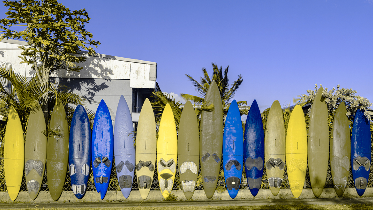
For example, one might create a call-to-action button using two brand colors. The color distinctiveness required for the user to read what action was requested might be obscured for a person who is color blind so that they are unable to take the action you are hoping to encourage. The text might be readable, but the colors might be “yucky looking” for your user and discourage them from your site. As you can see from the following pictures (Figure 2) from the Healthline blog, what seems like a nice colorful set of surfboards will appear very differently to a colorblind eye.

Figure 2: Normal vs protanopia (If you have protanopia, you’re “red-blind,” which makes red colors look greener.)

It is unlikely that you can create images perfectly viewable to every user, particularly with color blindness. Too often, though, image creators don’t do any research about this issue and only design for their own tastes and preferences—yes, their own biases—which makes their image designs fall short of the mark when it comes to good design and user-centeredness. Artful design might please one’s own sense of artiness, but will not necessarily reach the audience for your intended message.


* According to the World population statistics of male and female, https://countrymeters.info/en/World

† See also the very detailed article on Color blindedness on Wikipedia, https://en.wikipedia.org/wiki/Color_blindness

§ Here is one such browser app where you can check how your image appears for various types of color blindness. Or, Google, “How can I tell how my image looks to the color blind?” to find more options.

10 Commandments of Usability

The 10 Commandments of Good Website Usability, Jacob Nielsen’s “10 Usability Heuristics for User Interface Design,” are not actually commandments at all, but rather heuristics, or a kind of exploratory underlayment for creating guidelines for usable design.

Commandments or not, ignoring these principles should only be done purposefully, not out of ignorance. Everyone who designs information packages that might find their way onto the web (What information packages won’t find their way onto the web?) should know these usability principles and apply them as needed in their designs. You need to have good reasons not to follow established design principles for usability—and you must be objective, not subjective, in your approach. Don’t just say, “I don’t need that. I know what I want.” Too often those who create websites or write content for them don’t know good principles for user-centered design. At some point in the future, I hope to put together a blog series to help us flesh out how these specific principles. In the meantime, the 10 Commandments of Usability will help us form a solid foundation for creating good user-centered communication.

The audience or user is the center of what goes on in any communication, because

to communicate is to transmit information, thought, or feeling so that it is satisfactorily received or understood.”

When you communicate, you impart information to someone; you share that discreet unit of information—from you to other—so that you can have commonality with whoever receives it.

Once received, the ideas about the communicated information may change from the intended purpose of the sender, for example, the person receiving the communication may accept the information as factual or reject it as false; may be enraged or impassioned by it; may be swayed to act or discouraged from acting; may seek for more information or be satisfied with what they already know. Communication is a much more difficult and troublesome event than simply posting, saying, or writing something. Communication is not information upload.

colander-trick

Communication is not mechanical upload.

The mechanical approach (input > output) to communication has been all too common, however, and there are no signs that this is really changing, despite the availability of online information.  True, businesses and other entities, including individuals, increasingly are concerned with users and audience; we should be glad about that. Information about how to do a better job of designing for users is so much more accessible these days. For example, Nielsen’s Heuristics are easily found in multiple places online and, in fact, you can sign up to receive regular academically researched articles and updates from the Nielsen–Norman Group to improve your familiarity with usability principles. I would encourage you to do so.

The chance to become a better communicator on every level, including writing and designing for the web, is made much more accessible because of the Internet, everyone knows that. However, the broadening of the accessibility has also made the availability of web creating tools more pervasive and so has spread bad design and insensitivity to audience farther and wider than ever before.

How can these 10 “not-commanded” Commandments of Usability be useful to us generally in our day-to-day communication acts?

Can those people that find themselves creating content—whether on the web or anywhere else—find any principles that bring value to us when we create our designs? I hope to write a series of blogs in this year to discuss how these 10 principles apply to our communication events and designed artifacts.

References:

https://www.nngroup.com/articles/ten-usability-heuristics/

“Communicate.” Merriam-Webster.com. Merriam-Webster, n.d. Web. 28 May 2016.

“Abbott & Costello Who’s On First.” YouTube. Koch Entertainment, n.d. Web. 28 May 2016. <https://youtu.be/kTcRRaXV-fg&gt;.

Mind reading machine. Digital image. N.p., n.d. Web.

Abbot and Costello’s “Who’s on First?” (08:03)

Branding

The value of holding a consistent image and visual approach should be universally recognized, because it helps the user/audience you are trying to reach see your service as an organized system.

For example, if you need to label some doors at your business site or make signs for your location, don’t just go down to the hardware store and buy the first set of stick-on letters that you see, as I have seen done before, even by very large organizations, but put some thought into it with information design and branding in mind.

This is a great article and I wanted to share it for anyone wondering about why it would be important to create a consistent brand for their business or organization. Although the immediate focus is on user oriented projects, the ideas are useful to anyone wanting to learn more about branding.

“What is branding?”

Interaction Design.org

When you were at school, in all likelihood your mum/mom/mother (delete as necessary) probably stitched your name into all parts of your uniform and gym items. While the labels were probably itchy and annoying, they helped you keep track of your stuff by distinguishing them from everybody else’s clothes. Personalizing your things in this way, allowed you to say, definitively, that something was yours (unless your name is John Smith).

Branding works in much the same way. Companies and businesses attach names, logos, slogans, and specific design elements to their products to distinguish them from their competitors. However, while your school shirt, trousers, etc. simply had your name in them, company branding is focused on attaching or associating positive attributes to their products.”

Branding: Making Positive Associations

“We already make associations between certain words, colors, people, objects, styles, design features, and meaningful qualities, such as likeability, friendliness, sexiness, and wealth. Branding attempts to ensure the package they are offering or purporting to offer, bears positive qualities, rather than negative ones.

The brand of a company or specific product is essentially the idea or image they are trying to project, so consumers connect or identify with the whole group or one product in particular. Branding is meant to help make products instantly recognisable to consumers, and to ensure they help to maintain a positive image or reputation. It is for this reason that celebrity endorsers are dropped like a lead weight, if any indiscretion becomes public knowledge, Brands lose their meaning if the products become associated with people who are appearing in the news for negative reasons.”

Read more of the article here:


brands-of-us from Mental Floss article

Brands of the US map Credit: Steve-Lovelace.com

How to Design Your Graphics for Effective Communication, Part 2

Part 1 of this series presented a series of organizational patterns seen as basic content structures, such as the patterns of chronology, sequence, space, comparison and contrast, or cause and effect. The question was asked, “Which one of these patterns would best showcase the elements that I want obviated by my graphic design?” 

In Part 2, we will be discussing a basic approach to creating the underlying framework of an effective graphic.

How can designers ensure that the intended message comes across clearly in the graphics they create?

ONE THING USEFUL for beginning designers and non-design specialists would be to write a short purpose statement of what you are trying to accomplish and communicate by using graphics in your design. If you can’t clearly and unambiguously state with words what you are trying to communicate to the audience, you won’t be able to communicate that purpose clearly through the graphic you design, either. The purpose of your communication should be central to what is communicated to the audience; the “coolness” of a new infographic tool, color-combination template, neat font or latest tech-tool trick or trend, or whatever else distracts us, can work against clarity and effectiveness, making communication of intended meaning a hit-or-miss endeavor.

By zeroing in on your purpose through the written statement, you will be able to pull out some verbs and key concepts to clue you into the pattern of visual organization to best illustrate your information. For example, if you have a purpose statement that says something about illustrating the negative and positive issues involved in the “digital divide” you will see that several of the words—“negative/positive” and “divide”—point to a Compare and Contrast Pattern; in fact, such words almost beg the use of an illustration that divides the design space into two or more parts. If the pattern that is most implied by the words you use is not the type of organization that would best illustrate your point, you might consider selecting new words to better match whatever organizational pattern you envision for your message or else, make it very clear through your illustration why your words work against the grain of preconceived patterns.

The point is that going down “underneath the skin” of any graphic should tell you something about the graphics’ structure, about the basic idea, conceptual model, or organizational mode to drive your point forward or to frame the illustration. In creating a graphic to communicate something, you need to know what specifically you want to say before you start designing. If you structure your design with an organizational framework based on the “skeleton” of purpose, the details will follow from there, helping you know what creative method to use to design the artifact. Your message will get across to your audience with less ambiguity and more clarity, so that the audience will more quickly absorb and more thoroughly retain the information you present. You would be surprised how many people do not do this simple preparatory work before they put together a chart, figure, or graphic element.

A great process starts with a purpose statement, moves on to sketching a prototype, asks for user input at any and all stages, and then, makes decisions about what sort of software is needed for composing the graphic.

— Susan LaVelle

Aaron Kuehn. SKELETON TYPOGRAM

Skeleton Typogram by Aaron Kuehn is licensed under a Creative Commons Attribution-NonCommercial-NoDerivs 3.0 Unported License. http://aaronkuehn.com/art/skeleton-typogram

How to Design Your Graphics for Effective Communication, Part 1

I thought that it might be helpful to post some information to help beginners and non-designers plan out and design graphics that communicate what you want or need to say. There are a lot of things that go into making a good user-centered design and here I can only mention a few aspects to help you think through the basic underpinnings of your graphical presentation of information.

Communication

Cartoon, problems in communication solved by putting the correct idea into another's head.

Munroe, Randall. “Xkcd: Communication.” Web log post.  Xkcd: Communication. http://imgs.xkcd.com/comics/communication.png ©Creative Commons, Web. 08 April 2014.


AS A FUNDAMENTAL POINT, it is important to understand what you are trying to say— to understand the “What” and to say it—and not something else. What you want to say should be clear and unambiguous, so that the audience will be able to visually grasp the structure in which you are organizing information; the organizational pattern for the information should match the real-world structure of whatever you are trying to represent.


For example, if you wanted to show the structure of a course you teach, you might make an icon (here an orange circle labeled “Teacher”), encircled by smaller icons (blue triangles, each labeled by class participants’ names). A “Key” is needed to make clear to the user whatever meanings are assigned to code the graphic’s colors and shapes. Top it with a “Title”  and “Caption” it below. Don’t forget to add any citation information that denotes any source permissions and copyright details, including the website URL and date of website access.

A graphic explaining the point.

KEY:   Orange = Teacher and Blue = Student; Circle = Class administrator and Triangle = Participant


The graphic’s structure maps the real-world organization you want to illustrate.

The audience sees the organization of such a chart, graphic, or picture and understands and absorbs the information more easily, because the graphic representation of the information visualizes the real-world order of—in this instance—a particular classroom structure, helping the viewers of the graphic to store new information in their memory in a way that makes sense and aids informational recall. Such a graphic would match the real-world organization and hierarchy to the visual design chosen for the graphic to more easily place it in the memory as a match for the thing remembered: The graphic looks like the thing it represents. The viewer’s memory will store such a structure along with the details, and so, the information, as a whole, can be recalled in much more of its entirety when needed by the user.


A well-designed graphic will order information with clarity and precision, so that the viewer grasps both an overview of a body of information, which enlightens the viewer to a structural whole—or in other words, the big picture—and also focuses the viewer’s attention on “close-ups” of each discrete bit of information, which comprise the individual parts of that whole. A good graphic might indicate true hierarchies and patterns of order between the various elements of the information, for example, the nested sets and subsets within a dataset (e.g., administrators and the employees of their departments), the time sequence between different actions (e.g., “First you beat two eggs, then add sugar…”), or several completely conflicting elements (e.g., “Not this…, but this…”).


Additionally, before designing a graphic, you want to ask yourself several questions about the nature of the information that you want to show and about the way you want to show it. Information can be arranged in various ways and here are just a few, which I found on a website from the University of Washington, where more detail about organizing information into patterns can be found (http://faculty.washington.edu/ezent/impo.htm):

•          Chronological Patterns

•          Sequential Patterns

•          Spatial Patterns

•          Compare – Contrast Patterns

•          Advantages – Disadvantages Patterns

•          Cause – Effect Patterns

•          Problem – Solution Patterns

•          Topical Patterns

Ask yourself the question, “Which one of these patterns would best showcase the elements that I want obviated by my graphic design?” Sometimes the information you want to explicate can be shown using several methods (infographics, tables, graphs, figures, etc.) but not all of those modes will match your intended purpose in creating the graphic. You should understand which basic approach to use for clearly communicating your intended meaning to your audience, the user of the design; you should be clear about your intentions before you start designing.

— Susan LaVelle

Conventions in Information Design

What are Conventions?

A convention is a “rule, method, or practice established by usage.” *

In Information Design, conventions refer to what users expect from previous experience reading documents and/or using websites.

We encounter design conventions every day, on almost everything we read. The designers of web pages, billboards, and even food packaging take advantage of conventional placement and type hierarchy to supply information in a way users will understand.

Examples of Conventions:

Document Design Conventions:
Headings located at the top of relevant text sections in large font
Page numbers located at the bottom of each page
Image captions located beneath relevant image in small font

Web Design Conventions:
Logo located in the top left corner of the page
Search box located on the homepage
Links change color when clicked

Why are Conventions Important?

Every design is a conversation between a designer and a user.

By making use of conventions, designers take advantage of the experience users have had browsing other websites. By showing new users something they’ve already seen, designers create an immediate sense of familiarity in the user.

If a designer places headings, navigation, and search boxes where users expect to find them, the cognitive workload of the user is reduced. This allows users to concentrate on what a designer is trying to convey in a website or document, rather than how to navigate it.

Violated Conventions:

Designers should not violate convention thoughtlessly or in a way that creates more work for users. Otherwise, users can go elsewhere.

However, there are not hard and fast rules in design. Some designers make a conscious choice to break convention and it can be successfully done. The key is to be mindful of the cohesive power of conventions.

—Catherine Krecke

*www.mdictionary.com/definition/convention

Controlling your Home Page: The Designer as “Smothers’ Mother”


Image of Record Album cover, Smothers Brothers, "Mom Always Liked You Best!" with one brother having an overabundance of gifts on his side and the other brother only having a chicken.

© Smothers Brothers All rights reserved.
http://www.smothersbrothers.com/albums/smo05sm.gif
Accessed on December 5, 2013

Deciding what to feature on a “Home Page” is challenging. Bringing organization stakeholders to participate in that discussion can make this even more complex. Multiple perspectives provide information, but too often disparate stakeholder agendas enter the discussion. Similar to Tommy and Dick Smothers’ mother, a designer for an organization page cannot usually accommodate all interests equally. Consequently, designers can face conflict or resentment over who gets picked for Home Page “top billing.” By being aware of this risk, and by taking early steps to address it, designers can diminish the effects of unproductive stakeholder agendas.

(1)    Steve Krug, in “Don’t Make Me Think – A Common Sense Approach to Web Usability,” emphasizes that above all, the designer must have a concept of “the big picture” that drives the Home Page content. Krug cautions against adding any Home Page content that distracts from a big picture of “what the site is.” Developing and communicating that picture sets the context for development decisions of what to include.

(2)    Explain to stakeholders that the purpose of the home page is to deliver the user to the featured (stakeholder) content pages, not to establish a hierarchy of worth.

(3)    Establishing and following systematic decision-making processes helps to legitimize organizational decisions on Home Page content.

(4)    Communicating that process to stakeholders before making decisions should lead to better control of Home Page content.

Thankfully, Smothers’ mother did not follow this advice, leading instead of one of the funniest comeback lines in comedy. For an information design, however, designing a purposeful and productive Home Page requires us to be kind to all of our “children” by considering and addressing organizational stakeholder interests.

—Brian Wyneken