Part 1 of this series presented a series of organizational patterns seen as basic content structures, such as the patterns of chronology, sequence, space, comparison and contrast, or cause and effect. The question was asked, “Which one of these patterns would best showcase the elements that I want obviated by my graphic design?”
In Part 2, we will be discussing a basic approach to creating the underlying framework of an effective graphic.
How can designers ensure that the intended message comes across clearly in the graphics they create?
ONE THING USEFUL for beginning designers and non-design specialists would be to write a short purpose statement of what you are trying to accomplish and communicate by using graphics in your design. If you can’t clearly and unambiguously state with words what you are trying to communicate to the audience, you won’t be able to communicate that purpose clearly through the graphic you design, either. The purpose of your communication should be central to what is communicated to the audience; the “coolness” of a new infographic tool, color-combination template, neat font or latest tech-tool trick or trend, or whatever else distracts us, can work against clarity and effectiveness, making communication of intended meaning a hit-or-miss endeavor.
By zeroing in on your purpose through the written statement, you will be able to pull out some verbs and key concepts to clue you into the pattern of visual organization to best illustrate your information. For example, if you have a purpose statement that says something about illustrating the negative and positive issues involved in the “digital divide” you will see that several of the words—“negative/positive” and “divide”—point to a Compare and Contrast Pattern; in fact, such words almost beg the use of an illustration that divides the design space into two or more parts. If the pattern that is most implied by the words you use is not the type of organization that would best illustrate your point, you might consider selecting new words to better match whatever organizational pattern you envision for your message or else, make it very clear through your illustration why your words work against the grain of preconceived patterns.
The point is that going down “underneath the skin” of any graphic should tell you something about the graphics’ structure, about the basic idea, conceptual model, or organizational mode to drive your point forward or to frame the illustration. In creating a graphic to communicate something, you need to know what specifically you want to say before you start designing. If you structure your design with an organizational framework based on the “skeleton” of purpose, the details will follow from there, helping you know what creative method to use to design the artifact. Your message will get across to your audience with less ambiguity and more clarity, so that the audience will more quickly absorb and more thoroughly retain the information you present. You would be surprised how many people do not do this simple preparatory work before they put together a chart, figure, or graphic element.
A great process starts with a purpose statement, moves on to sketching a prototype, asks for user input at any and all stages, and then, makes decisions about what sort of software is needed for composing the graphic.
— Susan LaVelle
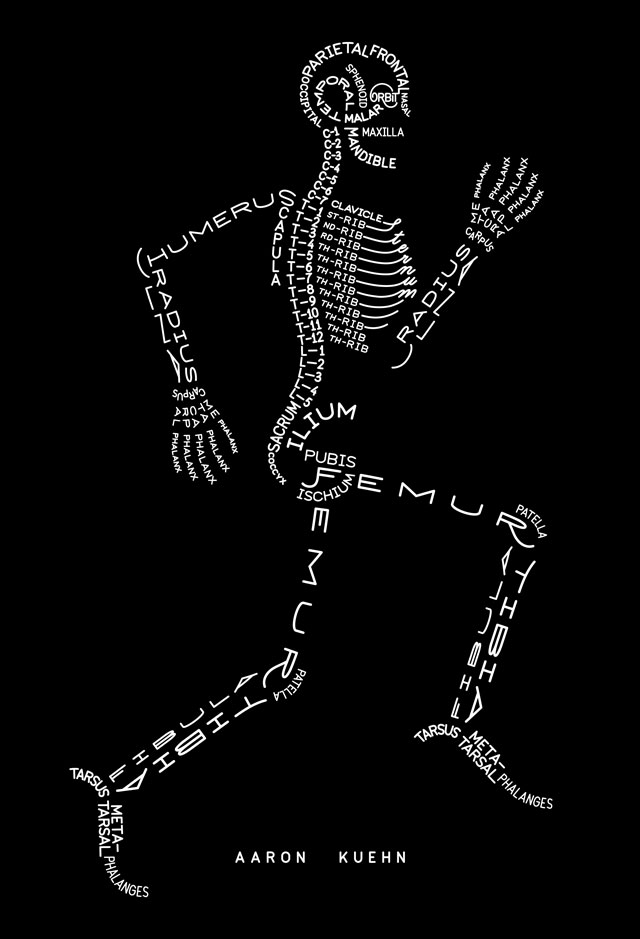
Skeleton Typogram by Aaron Kuehn is licensed under a Creative Commons Attribution-NonCommercial-NoDerivs 3.0 Unported License. http://aaronkuehn.com/art/skeleton-typogram
