Minimum Daily Requirements:

First in a series on

“Responsible Social Media Citizenship”

For solid research on what you accept as truth, you need to learn:

• who it is that is telling you something,

• why they are telling it to you,

• and what do those who disagree have to say.

This is the basics—the minimum—on learning to be accurately informed.

Real truth is nothing to be afraid of.

Why this series? Why now?

While watching a YouTube video that made some good points about comparing the viewpoints and biases of various news articles and resources, it was so obvious to me that even though the video narrator thought they were coming at it from an unbiased direction and that they were just simply presenting facts, they were not. The fact of the matter is that no one presents information in an entirely bias-free manner. Of course trying to do so is better than trying to manipulate with misinformation, disinformation, or non-information (see “Why is ID important?”). Lying, scamming, tricking, and intentionally misleading people to prevent them from learning accurate information is abhorrent, no matter how common we find it around us. Being aware of the difference between these bad and manipulative communication methods is going to be a starting point when it comes to keeping those who curate and share information on a path of well-supported research.

However, the responsibility rests on the person reading the website, app, blog, news article, or YouTube video to sieve through the information glut and test what is presented to you. To be a responsible social media citizen, you must take care in hearing and reading to test whether the communication deserves your precious trust in believing it—and especially—whether to pass it on to others.

And how will I know?

The answer to that question is what the series is about. As stated above, the bare minimum for being a responsible research-citizen has to do with how you approach some bit of information. Ask yourself those questions: “Who is telling me this?” “Why are they telling me?” and very importantly, “What do the people who disagree think?” If you can’t ascertain the answers to these questions, then you have no business sharing them with others. Even if you are a person who already wants to agree with some bit of information you are hearing or reading, you still need to understand all three of these things to be an effective and honest researcher.

It is all a part of loving the truth—which is why so many people say they want to share some informational tidbit they have read or heard: they want the truth to get out about something. However, if you don’t actually do the preparation to know and validate the truth of something before you believe it and share it with others, how much of a lover of truth are you? Not much; more than likely, you are a lover of what you already think, whether it is substantiated by accurate information or not.

People who think they are committed to getting the truth out hate to be thought of as liars, which is often what they call people who disagree with them. However, truth be told, when people pass on things that are not true, that is lying and it is liars who do it.

How to Design Your Graphics for Effective Communication, Part 2

Part 1 of this series presented a series of organizational patterns seen as basic content structures, such as the patterns of chronology, sequence, space, comparison and contrast, or cause and effect. The question was asked, “Which one of these patterns would best showcase the elements that I want obviated by my graphic design?” 

In Part 2, we will be discussing a basic approach to creating the underlying framework of an effective graphic.

How can designers ensure that the intended message comes across clearly in the graphics they create?

ONE THING USEFUL for beginning designers and non-design specialists would be to write a short purpose statement of what you are trying to accomplish and communicate by using graphics in your design. If you can’t clearly and unambiguously state with words what you are trying to communicate to the audience, you won’t be able to communicate that purpose clearly through the graphic you design, either. The purpose of your communication should be central to what is communicated to the audience; the “coolness” of a new infographic tool, color-combination template, neat font or latest tech-tool trick or trend, or whatever else distracts us, can work against clarity and effectiveness, making communication of intended meaning a hit-or-miss endeavor.

By zeroing in on your purpose through the written statement, you will be able to pull out some verbs and key concepts to clue you into the pattern of visual organization to best illustrate your information. For example, if you have a purpose statement that says something about illustrating the negative and positive issues involved in the “digital divide” you will see that several of the words—“negative/positive” and “divide”—point to a Compare and Contrast Pattern; in fact, such words almost beg the use of an illustration that divides the design space into two or more parts. If the pattern that is most implied by the words you use is not the type of organization that would best illustrate your point, you might consider selecting new words to better match whatever organizational pattern you envision for your message or else, make it very clear through your illustration why your words work against the grain of preconceived patterns.

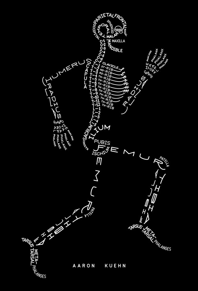
The point is that going down “underneath the skin” of any graphic should tell you something about the graphics’ structure, about the basic idea, conceptual model, or organizational mode to drive your point forward or to frame the illustration. In creating a graphic to communicate something, you need to know what specifically you want to say before you start designing. If you structure your design with an organizational framework based on the “skeleton” of purpose, the details will follow from there, helping you know what creative method to use to design the artifact. Your message will get across to your audience with less ambiguity and more clarity, so that the audience will more quickly absorb and more thoroughly retain the information you present. You would be surprised how many people do not do this simple preparatory work before they put together a chart, figure, or graphic element.

A great process starts with a purpose statement, moves on to sketching a prototype, asks for user input at any and all stages, and then, makes decisions about what sort of software is needed for composing the graphic.

— Susan LaVelle

Aaron Kuehn. SKELETON TYPOGRAM

Skeleton Typogram by Aaron Kuehn is licensed under a Creative Commons Attribution-NonCommercial-NoDerivs 3.0 Unported License. http://aaronkuehn.com/art/skeleton-typogram