Branding

The value of holding a consistent image and visual approach should be universally recognized, because it helps the user/audience you are trying to reach see your service as an organized system.

For example, if you need to label some doors at your business site or make signs for your location, don’t just go down to the hardware store and buy the first set of stick-on letters that you see, as I have seen done before, even by very large organizations, but put some thought into it with information design and branding in mind.

This is a great article and I wanted to share it for anyone wondering about why it would be important to create a consistent brand for their business or organization. Although the immediate focus is on user oriented projects, the ideas are useful to anyone wanting to learn more about branding.

“What is branding?”

Interaction Design.org

When you were at school, in all likelihood your mum/mom/mother (delete as necessary) probably stitched your name into all parts of your uniform and gym items. While the labels were probably itchy and annoying, they helped you keep track of your stuff by distinguishing them from everybody else’s clothes. Personalizing your things in this way, allowed you to say, definitively, that something was yours (unless your name is John Smith).

Branding works in much the same way. Companies and businesses attach names, logos, slogans, and specific design elements to their products to distinguish them from their competitors. However, while your school shirt, trousers, etc. simply had your name in them, company branding is focused on attaching or associating positive attributes to their products.”

Branding: Making Positive Associations

“We already make associations between certain words, colors, people, objects, styles, design features, and meaningful qualities, such as likeability, friendliness, sexiness, and wealth. Branding attempts to ensure the package they are offering or purporting to offer, bears positive qualities, rather than negative ones.

The brand of a company or specific product is essentially the idea or image they are trying to project, so consumers connect or identify with the whole group or one product in particular. Branding is meant to help make products instantly recognisable to consumers, and to ensure they help to maintain a positive image or reputation. It is for this reason that celebrity endorsers are dropped like a lead weight, if any indiscretion becomes public knowledge, Brands lose their meaning if the products become associated with people who are appearing in the news for negative reasons.”

Read more of the article here:


brands-of-us from Mental Floss article

Brands of the US map Credit: Steve-Lovelace.com

Documentation Management

“Documentation management is the bane of many a project manager’s existence. Yet, without a clear and simple documentation management system projects often go astray. Your team members need to be able to find their documentation when they need it. If they can’t; they’ll go and do other things instead–or waste hours of time trying to find it. Neither of these things is good for the health of your User interaction (UX) project. So let’s look at some simple tips for better document management on UX projects:” For more of the article, click here.

Dilbert Naming Conventions

Quizzing your Quizzes: Verify your “Shares” on Facebook, Part 2

And what about all those posts, blogs, and articles that we share on FB? Can I investigate more thoroughly before I click share? Here are just a couple of things worth considering when investigating the sources of what we post:

Dandelion Silhouettes with Flying Seeds http://www.freepik.com/

Everyone needs to be more careful to choose which posts, blogs, and websites they are willing to expose their friends and family to through electronic media sharing.

What is the actual address of that website? The legitimacy of a shared posting or shared quiz, such as that game, coupon, or other marketed post you want to share with your FB friends, will almost surely show on the actual domain name of the website that you have clicked to from the shared post, quiz, or blog article. To find that out, click on the address bar in your browser (i.e., box at the top of that webpage) of any website to look at the full domain name on the URL (i.e., entire http//:www.address); if that web address looks fishy (i.e., it doesn’t sound like the kind of address that matches that company’s real website or the address doesn’t look like it matches any legitimate-looking company), the website might not really be sponsored by the company you think that you are clicking to, but actually something about it might be false. If the article or blog post says it is from some or another news source, like the New York Times, then if the website or Facebook page is a little off from that, say, “Newyourk Times” or some such, pay attention to that and be warned.

A caveat to that point is that sometimes the web address of a company doesn’t necessarily look like a match to a site. This might happen for several reasons, since sites are hosted in lots of various ways, including those free hosting sites that want to include some of their business’ name in the web address; also, some hosting companies or some parent companies of businesses have domain names that rule over the whole organization. For example, a daughter company or a company that merged or was bought out might have a website name that reflects the larger corporate entity of which the site you want is only a small part. Also URLs/web addresses have always been dispensed on a first-come, first-serve basis to whoever pays for the name, even if they have nothing to do with the actual company; in this case, some individual was able to get a jump on a name and then sort of hold it for ransom to the highest bidder, so sometimes the name someone wants is simply already owned. However,  most large companies, like Target or Coke, pay for the URL or website name that they want and own the legitimate web addresses to match pretty well with their name. In most cases, whatever entity is trying to drive you to its website, should have a website or domain name that makes sense to you. In other words, what you think is a “funny” or not matching web address, might not really be funny at all; therefore, matching the name to the site is a yellow light for skepticism, but not a full stop sign.

A bigger flashing light to raise our skepticism about the originator of a shared article or posting: after following back on a shared post, worry if you find that the website that shared it doesn’t contain any findable identifying information that indicates the identity of the site or the articles’ publishers or authors. If a website hasn’t posted any information about who they are, such as is found on an “About page,” a “Contact us” page, or an “Archive” or “History” page, then be skeptical about whatever they are publishing or sharing. Everything published should be verifiable and subject to reasonable push-back, whether the information sets the date for the original publication, research study, or the names and qualification of the author or researcher. “Who said that? Why should I believe them? What are their credentials?” are essential questions that always need answers. If no answers to these questions can be determined from the site, don’t bother sharing items from that site. Some sites welcome feedback and host discussion forums about the topics addressed. Reading through this feedback can enrich the experience on the website, but of course often, there is a lot of garbage found on such discussions. When you are sharing articles, don’t forget that you are also sharing the discussion boards, the ads, the other links that are on that website, so anything you share, will also share whatever links to that link. These links are a chain; we are talking about the metaphor of a “web,” after all.  You could unknowingly be linking your family and friends to a chain of inaccurate or unsupported information .

Also, if the originating dates of the blogs, postings, or articles you find on these sites are older than a year or two,or if the articles don’t have any supporting evidence, such as the citations for the references to their claims, then I would not share anything from that website (or believe anything that they say, actually). Frequently, I have seen someone share an “article” on FB, that when “clicked,” shows a website or a blog that paraphrases or quotes another blog or website, that when clicked, leads to a seemingly endless chain of websites/blogs/links that have quoted from that same article, but none of them have ever attributed the work to an author or a date or an original published source for the material. If you do happen to follow all of this and find the beginning link in the chain, often you will find yourself several years—if not decades—into old material with a questionable validity to begin with and one that has clearly become outdated. Sadly, the lie, the debunked, and the misinformed have an “eternal” life online, because the unsubstantiated, the inaccurate, and the outdated are linked and shared unendingly.

Quizzing your Quizzes: Verify your “Shares” on Facebook, Part 1

Do you ever worry about all those quizzes shared on FB? What some of these quiz sites might really want is your information—the information that you don’t generally share with strangers, such as access to your FB page and your contacts’ list.

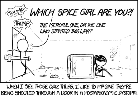
Munroe, Randall. “Xkcd: Communication.” Web log post. Xkcd: Communication. Copyright Creative Commons, Web. 13 April 2015. http://xkcd.com/1511/

Munroe, Randall. “Xkcd: Communication.” Web log post. Xkcd: Communication. Copyright Creative Commons, Web. 13 April 2015. http://xkcd.com/1511/

I have taken some of these quizzes myself. They are almost irresistible and usually quite self-congratulating, but recently, something was a bit odd about a quiz that I had just taken. It seemed a bit suspicious that I, as well as all of my friends taking the quiz, started posting that everyone had received scores of 100% correct, even though some of the questions had been quite obscure. (After all, who, besides me, knows anything about the Muscovite princes?) This result raised my curiosity and made me suspicious in a way that I probably should have been already.  I decided to stop taking the quizzes altogether. These quizzes seem to pop-up with an increasing rapidity, with their fun and attractive topics that appeal to everyone in an upbeat style and eye-catching images—favorite Disney princesses, favorite Beatle’s songs, favorite movies, favorite states, favorite form of mineral deposit—all just part of the fun and appeal of Facebook. However, who of us ever asks any questions about the things that we “Share” with each other, including these quizzes? How many of us ask, “Who is behind this?” or “Why should I give that nameless entity access to all of my ‘Friends and contacts?”

And what about all those posts, blogs, and articles that we share on FB? Can I investigate more thoroughly before I click share? Here are just a couple of things worth considering when investigating the sources of what we post:

First of all, you can copy the source or name associated with the FB quiz or website, by opening up a tab in your browser and pasting that name in a search box (or in other words, googling it). Sometimes that site or web address will have been researched already by people who have reviewed it to praise or debunk it. This first and most basic stop on the way to validating the legitimacy of a site is rarely even reached by most people. Do you think of this before you share something on Social Media?

Most people, unfortunately, see something, and “click”—share it. Googling Snopes.com or urbanlegends.about.com or charitynavigator.org or else, just trying to get some further and more objective information about the source of a post or quiz, should be the first step in satisfying my most basic need for verification and curiosity. If you think something is interesting, make sure that it really is worth sharing.

Additionally, the FB professional page of a legitimate source, such as a well-known company, will clearly show an appropriate number of followers to match their prominence (i.e., millions of followers for a major business, thousands or hundreds of followers for a local one) and their FB business page will click back to their real, working website and other social media (i.e., the Coca-cola business page will click back to their site where you can sign up for their legitimate Twitter stream; my professional page, “Susan W. LaVelle, Information Design” will show you my website, susanwlavelle.com, and clicking to my website, will show a live feed for my FB professional page and Twitter feed, both of which will link you back to my websites). Anything requested or shared on FB would more likely be found as legit if it links to the connections that legitimate that site as a reliable source. Finding openness and clarity helps to verify that the Facebook page that you are sharing from is actually what you think it to be.

How to Design Your Graphics for Effective Communication, Part 2

Part 1 of this series presented a series of organizational patterns seen as basic content structures, such as the patterns of chronology, sequence, space, comparison and contrast, or cause and effect. The question was asked, “Which one of these patterns would best showcase the elements that I want obviated by my graphic design?” 

In Part 2, we will be discussing a basic approach to creating the underlying framework of an effective graphic.

How can designers ensure that the intended message comes across clearly in the graphics they create?

ONE THING USEFUL for beginning designers and non-design specialists would be to write a short purpose statement of what you are trying to accomplish and communicate by using graphics in your design. If you can’t clearly and unambiguously state with words what you are trying to communicate to the audience, you won’t be able to communicate that purpose clearly through the graphic you design, either. The purpose of your communication should be central to what is communicated to the audience; the “coolness” of a new infographic tool, color-combination template, neat font or latest tech-tool trick or trend, or whatever else distracts us, can work against clarity and effectiveness, making communication of intended meaning a hit-or-miss endeavor.

By zeroing in on your purpose through the written statement, you will be able to pull out some verbs and key concepts to clue you into the pattern of visual organization to best illustrate your information. For example, if you have a purpose statement that says something about illustrating the negative and positive issues involved in the “digital divide” you will see that several of the words—“negative/positive” and “divide”—point to a Compare and Contrast Pattern; in fact, such words almost beg the use of an illustration that divides the design space into two or more parts. If the pattern that is most implied by the words you use is not the type of organization that would best illustrate your point, you might consider selecting new words to better match whatever organizational pattern you envision for your message or else, make it very clear through your illustration why your words work against the grain of preconceived patterns.

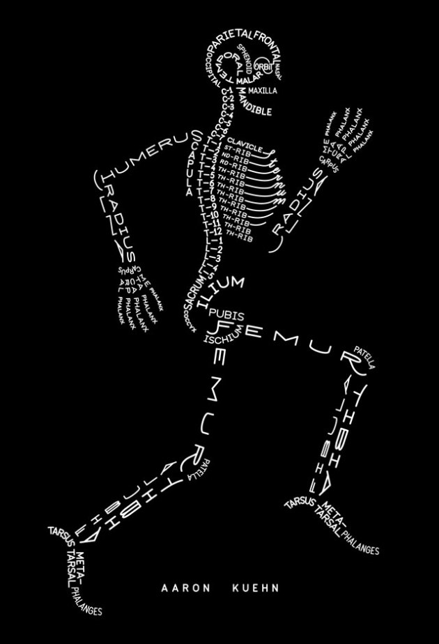
The point is that going down “underneath the skin” of any graphic should tell you something about the graphics’ structure, about the basic idea, conceptual model, or organizational mode to drive your point forward or to frame the illustration. In creating a graphic to communicate something, you need to know what specifically you want to say before you start designing. If you structure your design with an organizational framework based on the “skeleton” of purpose, the details will follow from there, helping you know what creative method to use to design the artifact. Your message will get across to your audience with less ambiguity and more clarity, so that the audience will more quickly absorb and more thoroughly retain the information you present. You would be surprised how many people do not do this simple preparatory work before they put together a chart, figure, or graphic element.

A great process starts with a purpose statement, moves on to sketching a prototype, asks for user input at any and all stages, and then, makes decisions about what sort of software is needed for composing the graphic.

— Susan LaVelle

Aaron Kuehn. SKELETON TYPOGRAM

Skeleton Typogram by Aaron Kuehn is licensed under a Creative Commons Attribution-NonCommercial-NoDerivs 3.0 Unported License. http://aaronkuehn.com/art/skeleton-typogram

How to Design Your Graphics for Effective Communication, Part 1

I thought that it might be helpful to post some information to help beginners and non-designers plan out and design graphics that communicate what you want or need to say. There are a lot of things that go into making a good user-centered design and here I can only mention a few aspects to help you think through the basic underpinnings of your graphical presentation of information.

Communication

Cartoon, problems in communication solved by putting the correct idea into another's head.

Munroe, Randall. “Xkcd: Communication.” Web log post.  Xkcd: Communication. http://imgs.xkcd.com/comics/communication.png ©Creative Commons, Web. 08 April 2014.


AS A FUNDAMENTAL POINT, it is important to understand what you are trying to say— to understand the “What” and to say it—and not something else. What you want to say should be clear and unambiguous, so that the audience will be able to visually grasp the structure in which you are organizing information; the organizational pattern for the information should match the real-world structure of whatever you are trying to represent.


For example, if you wanted to show the structure of a course you teach, you might make an icon (here an orange circle labeled “Teacher”), encircled by smaller icons (blue triangles, each labeled by class participants’ names). A “Key” is needed to make clear to the user whatever meanings are assigned to code the graphic’s colors and shapes. Top it with a “Title”  and “Caption” it below. Don’t forget to add any citation information that denotes any source permissions and copyright details, including the website URL and date of website access.

A graphic explaining the point.

KEY:   Orange = Teacher and Blue = Student; Circle = Class administrator and Triangle = Participant


The graphic’s structure maps the real-world organization you want to illustrate.

The audience sees the organization of such a chart, graphic, or picture and understands and absorbs the information more easily, because the graphic representation of the information visualizes the real-world order of—in this instance—a particular classroom structure, helping the viewers of the graphic to store new information in their memory in a way that makes sense and aids informational recall. Such a graphic would match the real-world organization and hierarchy to the visual design chosen for the graphic to more easily place it in the memory as a match for the thing remembered: The graphic looks like the thing it represents. The viewer’s memory will store such a structure along with the details, and so, the information, as a whole, can be recalled in much more of its entirety when needed by the user.


A well-designed graphic will order information with clarity and precision, so that the viewer grasps both an overview of a body of information, which enlightens the viewer to a structural whole—or in other words, the big picture—and also focuses the viewer’s attention on “close-ups” of each discrete bit of information, which comprise the individual parts of that whole. A good graphic might indicate true hierarchies and patterns of order between the various elements of the information, for example, the nested sets and subsets within a dataset (e.g., administrators and the employees of their departments), the time sequence between different actions (e.g., “First you beat two eggs, then add sugar…”), or several completely conflicting elements (e.g., “Not this…, but this…”).


Additionally, before designing a graphic, you want to ask yourself several questions about the nature of the information that you want to show and about the way you want to show it. Information can be arranged in various ways and here are just a few, which I found on a website from the University of Washington, where more detail about organizing information into patterns can be found (http://faculty.washington.edu/ezent/impo.htm):

•          Chronological Patterns

•          Sequential Patterns

•          Spatial Patterns

•          Compare – Contrast Patterns

•          Advantages – Disadvantages Patterns

•          Cause – Effect Patterns

•          Problem – Solution Patterns

•          Topical Patterns

Ask yourself the question, “Which one of these patterns would best showcase the elements that I want obviated by my graphic design?” Sometimes the information you want to explicate can be shown using several methods (infographics, tables, graphs, figures, etc.) but not all of those modes will match your intended purpose in creating the graphic. You should understand which basic approach to use for clearly communicating your intended meaning to your audience, the user of the design; you should be clear about your intentions before you start designing.

— Susan LaVelle

On the Recent Idea of Banning the Word, “Bossy,” Part 2

I was one of the first people to comment on this discussion in an online forum and after following the postings placed after I made my comment (see my blog posting), I wanted to remind us all, men and women, how easy it is to be deceived into believing that the critiques of others are unjustified, because “we are just misunderstood” or because other people are holding us back. Have you manipulated people, telling them what to do without listening to them, imposing your own agenda without thinking of the greater good, and in general, not using the people skills that make other people feel valued? Maybe your demeanor is making people feel uncomfortable and “bossed around?”

Women should be empowered and not held back, but since most of what happens in the world today—at work or in life—happens on teams, they should learn how to work well with people. Teams need leaders, but teams need leaders that communicate well with others. “Bossy” is a word primarily about communication and the communicator’s demeanor; although obviously this word is a hurtful slur used to demean, “bossy” primarily describes a demeanor by which most people would not like to be led, whether the leader is a woman or man.

Name-callers use the word “bossy” against women who step up to lead using ambition, self-direction, and their intelligence or talents in the world or workplace, but sometimes women and men use an ineffective and bossy-style, without listening to others and neglecting to build a team. Shouldn’t our focus be more on helping our girls become leaders and good communicators in whatever situation they find themselves? If so, then girls need to be taught how to communicate excellently and how to evaluate the criticism they receive for their failures to communicate or lead. Girls need to learn to become self-evaluators, rather than to become self-justifiers. Successful people learn from their mistakes.

As women, we will be criticized, rightly or wrongly, but what we do with that criticism will determine our growth—if criticism is misplaced, we grow in stature by rising above it, if the criticism is deserved, in full or in part, we grow by acknowledging our mistakes, changing our behaviors, and learning from the process. Girls need to be taught how to believe in themselves so that they are not crushed when misunderstood, but also, how to see life as a process wherein we must learn truth about ourselves in order to grow and do better. Honest self-examination is required in order to sort out what part of the criticism we receive is justified and what part is not.

The age we live in is not one of self-examination, but one of self-justification, but true leaders take on this challenge to learn from their mistakes.

On the Recent Idea of Banning the Word, “Bossy” Part 1

In the recent discussions of banning the word “bossy,”* I sincerely hope that both women and men would conduct a self-examination of their own leadership style.

There is no need for anyone to defend the word, “bossy,” as if the characteristics the word usually reflects are desirous; or to attack it, as if the use of this word can only reflect the user’s poor view on ambitious women. Ambition is one thing, but there is a huge difference between the effects of someone’s ambition and what we usually “feel” when someone is “bossy” because such a person makes us feel manipulated, un-respected, and walked over. No one should be defending that sort of negative, “bossy” behavior, as if leadership or management require it. We have all met people of either gender, who are confused about how to lead others, thinking that the need to support their own importance gives them a license to tear others down.

We should all be sure that no one has genuine reason to accuse us of being a bossy person, because the connotations of the word have more to do with a lack on our part, not our gifts, no matter our gender.


* Drexler, Peggy. “Sheryl Sandberg wrong on ‘bossy’ ban.” CNN. 01 Jan. 1970. Cable News Network. 13 Mar. 2014 <http://www.cnn.com/2014/03/11/opinion/drexler-sandberg-bossy/>.

Mcfadden, Cynthia, and Jake Whitman. “Sheryl Sandberg Launches ‘Ban Bossy’ Campaign to Empower Girls to Lead.” Video blog post. ABC News. 10 Mar. 2014. 14 Mar. 2014 <http://abcnews.go.com/US/sheryl-sandberg-launches-ban-bossy-campaign-empower-girls/story?id=22819181>.

Rogers, Katie, and Ruth Spencer. “‘Banning bossy isn’t the answer’: What real parents say about Sandberg’s plan.” Theguardian.com. 13 Mar. 2014. Guardian News and Media. 14 Mar. 2014 <http://www.theguardian.com/commentisfree/2014/mar/13/ban-bossy-sheryl-sandberg-quotes-real-parents>.

Wente, Margaret. “Ban ‘bossy’? Suck it up, girlsAdd to …” The Globe and Mail. 14 Mar. 2014 <http://www.theglobeandmail.com/globe-debate/ban-bossy-suck-it-up-girls/article17470665/>.

InformationDesign-Cast: Thinking

Design-material-brain-thinking-3-vector-material

Image by http://anysnapshot.com/ licensed under Creative Commons.

In this episode, we discuss thinking (or maybe not thinking) in terms of how a viewer doesn’t want to think. Designers need to put a lot of thought into items that are intuitive or self-explanatory.

Listen to this episode of the podcast on thinking

[audio http://kwonx059.podbean.com/mf/play/zvcb3/Thinking.mp3]

Download

Don’t Make Me Think by Steve Krug

Social media and your ID goals

The limitations and disadvantages of using social media are especially obvious when poor planning or imprudent word choice leads to legal suits, firings, divorces, laughs on late-night comedy, politicians losing the public trust, and more, all because someone did not think before they posted. The saying that a carpenter should “Measure twice, cut once” should be applied to posting, in “Think twice—thrice, or more—then post.” A genie can’t be put back into the bottle after it is let out, so any comment or posting that you make online, whether done in an “on or off” professional attitude, can’t be undone.

Cartoon Image with 2 executives discussing social media without considering the consequences

SEAN R. NICHOLSON © COPYRIGHT 2012 SOCMEDSEAN
http://www.socmedsean.com/cartoon-rushing-headlong-into-social-media/

Avoiding this kind of trouble has layers beneath its surface: even when posting in a professional capacity—for example, posting comments as an editor on an editor’s forum—you can easily be misunderstood or forget to put yourself into the shoes of the audience or say something that has rhetorical implications that you did not realize at first. A quickly turned-out comment or posting might have negative consequences to you professionally if you don’t take the time to read (and reread) what you have written before you post.

Just like in all writing, you must analyze your posting according to: audience, tone, point of view, voice, vocabulary, grammar, and so on. Obviously, you should reflect your professional sound judgment by bias-free word usage, no typos, good graphics, etc. in all your social media interactions.

However, having said all that, posting on forums, commenting on blogs, tweeting, and using other interactive social media are great ways to make professional contacts, provided you understand the forum and its audience, and provided you contribute value to the discussion (i.e., where the audience values your contribution as much as you do). I personally have made some good professional editing contacts by judiciously posting on LinkedIn discussion forums about things within my sphere of expertise.

With that as a foundation, here is a major way that social media could support your ID goals: your social media comments can place your site and message within a context of the shared space of the whole professional community and its messages. In other words, use of social media gives you opportunities to project yourself both thoughtfully and with discretion and precision to impress an audience of users or at least increase your visibility. These users make up your target audience. Social media use helps you to keep up with your profession as it changes, as you follow those resources—whether individuals, publications, businesses—that let you in on cutting edge topics and new technologies, online spaces, discussions, problems, solutions, and change-leaders; social media use also lets you represent yourself or your business professionally.

You show your ability to contribute value to these discussions as you enter the shared space of your professional community, and then, you continue to update yourself as the space grows and changes. You link to what will benefit you and link others to that benefit; you update continuously to change along with the changes that are continuously happening around you.

—Susan LaVelle